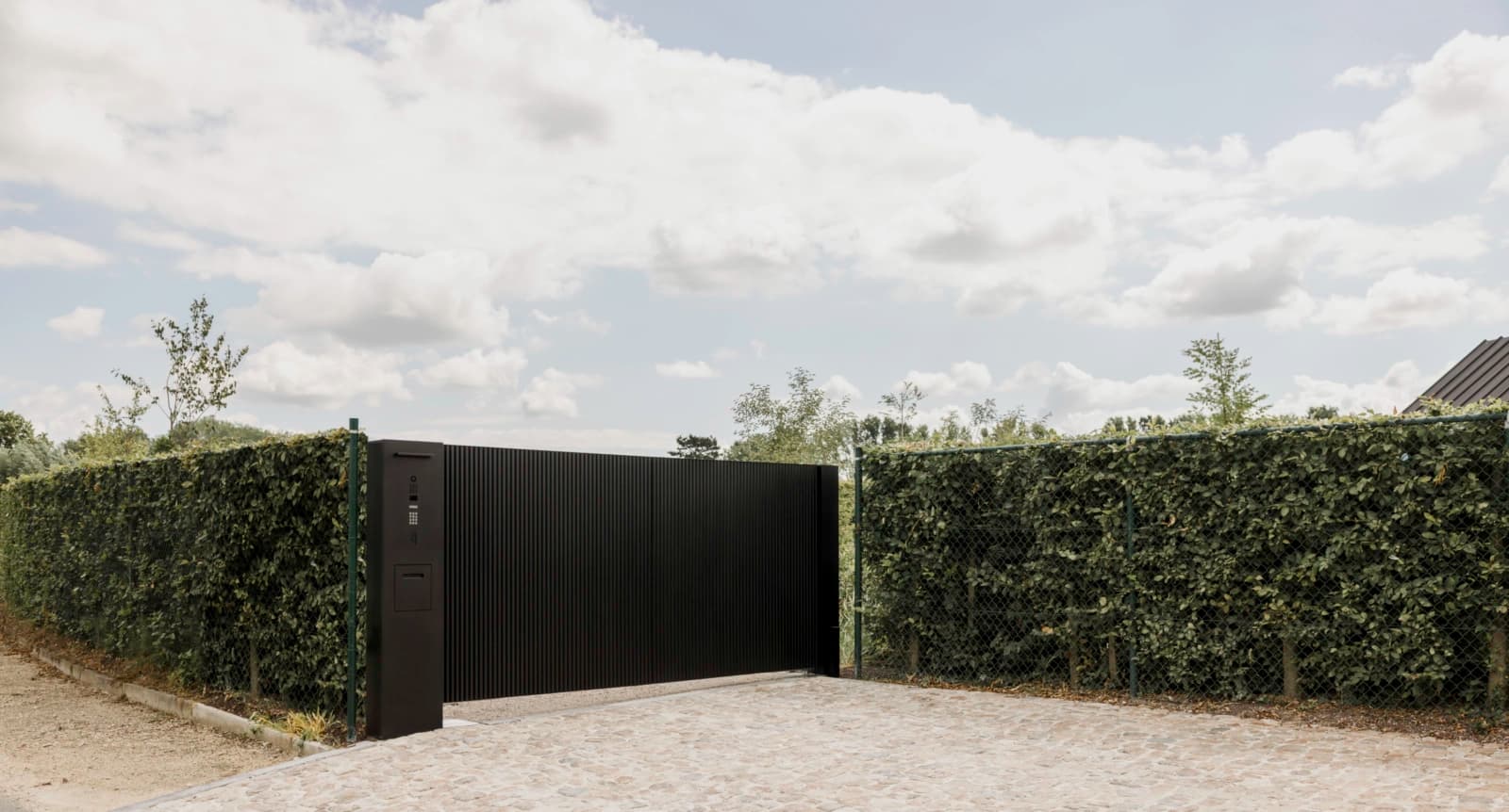
Why choose a mailbox in RAL colour
Most mailboxes come in a handful of standard colours. That works, but it limits you as soon as your facade has a tone of its own. A colour matched mailbox makes the whole look calmer: the design either disappears into the brickwork or deliberately does not, depending on what you want.
RAL is a colour range widely used in construction and industry. It includes both neutral shades and saturated colours, each with a fixed code. That way you know in advance which colour you will get and you can match it to your front door, the joinery or the plinth. There are mailboxes with a wide selection of RAL colours, so you are not stuck with black, grey or white.
The models and their colour options
The Topa is a clean lined mailbox with a sleek front. It lends itself both to a dark, understated finish and to a shade that deliberately stands out. If you want a black mailbox that does not stand out against a dark facade, a deep RAL black is a logical choice.
The Fenix has a pronounced design and comes into its own in a colour you dare to show. Think of a warm earth tone against a brick facade, or a cool grey against concrete and glass. Because the shape is already striking, the colour determines how strongly it asserts itself.
The Nexus Ensemble is a composite whole, for example with a parcel compartment next to the letter section. With a wider volume like this, it is best to consider how the colour behaves across the full width: a dark shade keeps the whole compact, a light shade makes it look wider. For models with a combination lock or parcel compartment, specific options apply; check this with an authorised sales point.
Choosing a RAL colour that keeps working
Start with what is fixed: the facade, the front door, the joinery. Take a sample outside and look at it in daylight, under cloud and in the evening. Colour under artificial light differs greatly from colour in the sun, and a mailbox is usually mounted outside.
If you want the mailbox to blend into the whole, choose a shade close to the facade or the door. If you want an accent, deliberately go a step further. For a design mailbox that is allowed to work as a detail, a contrasting colour is often stronger than yet another shade of grey.
Do not forget the surroundings: a row of terraced houses, a detached home or an apartment building each call for a different approach. Match your choice to what stands next to and opposite you, not only to your own facade. That way the mailbox keeps working when the street changes.
Further reading: Choosing a RAL colour · Black mailbox · Design mailbox